Life-Time

Life-Time

Client: Carnegie Mellon University

Wouldn't it be cool if there was a platform that encourages self-improvement rather than doomscrolling?

ROLE

Product Designer

TOOLS

Figma

Notion

DURATION

5 months

IMPACT

Helped users reclaim over 3 hours of daily screen time through intentional nudges and habit-forming design.

Reading is hard. Wanna play instead?

Use Fullscreen mode for the best experience.

CONTEXT

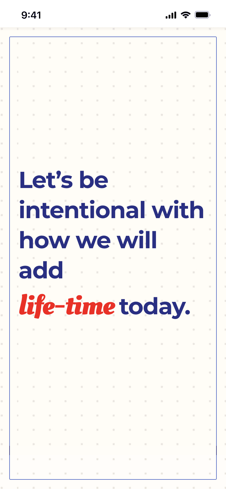
In an era where global social media usage averages 2.5 hours daily, compulsive scrolling and digital overconsumption have emerged as critical threats to mental health, productivity, and real-world social connection. Our design team proposed a mobile application, Life-Time, designed to combat doom scrolling and unhealthy digital habits by redirecting users toward intentional, fulfilling activities while leveraging psychological principles to sustain behavior change. The app’s persuasive aim is threefold:

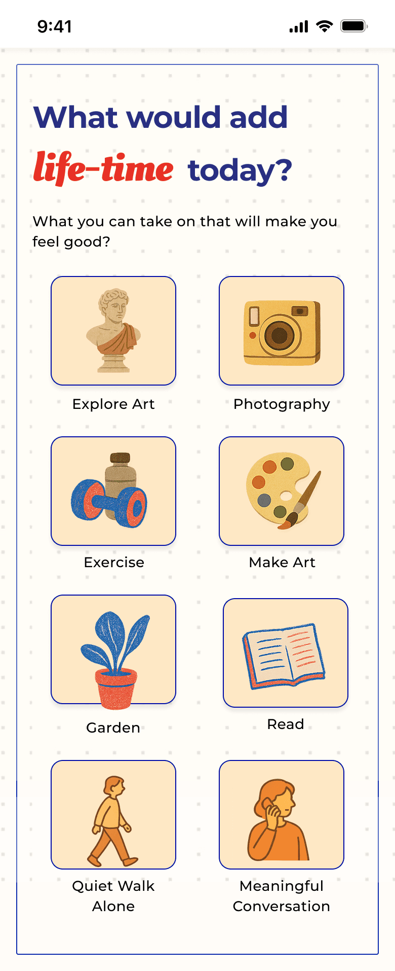
  1. Substitute passive scrolling with curated offline/online activities (e.g., museum visits, photography, workouts)

  2. Reinforce self-improvement through activity journaling and progress tracking

  3. Harness social motivation via shared achievements and community support.

RESEARCH

To reimagine digital wellness, the design of Life-Time is grounded in behavioral psychology. Particularly by engaging the mechanics of habit formation, cognitive dissonance, and priming.

Our Goal:

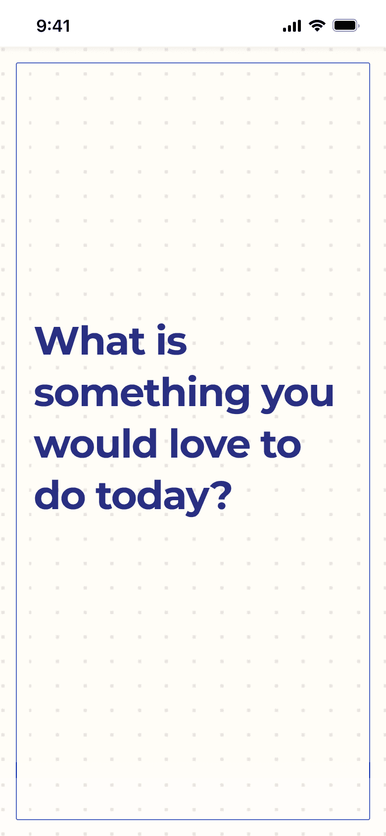
Not to block attention-draining apps, but to replace them with intentional experiences that align with a user’s deeper values.

Shifting from System 1 to System 2 Thinking

Most social platforms capitalize on System 1 thinking—fast, reactive behaviors triggered by infinite scroll and variable rewards. Instagram’s pull-to-refresh, for example, replicates the psychology of slot machines. Life-Time interrupts this cycle by engaging System 2: users make deliberate choices like “Sketch for 30 minutes” rather than passively consuming content. This cognitive friction—backed by dual-process theory—activates reflection and executive decision-making, gently reshaping user habits through conscious intention.

Competitive Analysis

We evaluated adjacent products like Freedom, Habitica, and Rosebud to identify white space:

  • Freedom/Offtime block distractions but don’t offer meaningful alternatives—leading users back to boredom loops.

  • Habitica gamifies tasks but lacks environmental context (e.g., location-based activities).

  • Rosebud supports mood tracking but misses social reinforcement.

Life-Time fills this void by connecting self-improvement with community, offering guided autonomy, and embedding wellness into real-world moments.

Designing with Priming and Environmental Cues

We embedded subtle behavioral nudges throughout the interface to inspire creative, restorative action:

  • Visual priming: Aspirational imagery—finished artworks, serene yoga scenes—activates wellness-related schemas.

  • Social contextual cues: Notifications like “Jasmine just visited the MOMA—ready for your next adventure?” use social proof to encourage exploration.

  • Color psychology: Inspired by Riot Games’ research, we used blue-toned prompts to reduce anxiety and promote calm. Studies show such visual cues can elevate creativity by over 20%.

These elements work in concert to make positive action feel intuitive and emotionally resonant.

DESIGN DECISIONS

Prototype 1: Testing the Core Concept and Input Method

Our first prototype was a low-fidelity "Wizard of Oz" test focused on validating the core concept and a primary input method: voice messages.

Key Learnings & Decisions:

  • Positive Concept Validation: Users responded favorably to the core idea. All participants completed their challenged activity within 48 hours and reported that the process made them more mindful. This confirmed our hypothesis that a reflective, challenge-based system could be effective.

  • Voice Input is a No-Go: The primary negative feedback was the discomfort and inconvenience of recording voice messages. Users cited privacy concerns in shared living spaces and self-consciousness about hearing their own voices.

  • Decision: We decided to pivot away from voice-only input and explore a variety of methods, including text and dictation, to accommodate user comfort and privacy. We also learned that users preferred minimal nudging, which reinforced our commitment to user-controlled notifications.

Prototype 2: A/B Testing Onboarding Flows

With the core concept validated, we moved to designing the onboarding experience. We created two distinct flows to test our assumptions about user motivation.

  • Flow 1 (Reflection-First): Asked users to answer reflective prompts before creating a "bucket list" activity.

  • Flow 2 (Activity-First): Allowed users to select a general activity before setting an intention.

Key Learnings & Decisions:

  • Initial Preference for Visuals and Low Cognitive Load: In this round, 4 out of 5 users preferred Flow 1, citing its visual nature and structured prompts which required less initial thinking.

  • Balancing Text and Visuals: A key insight was the need to strike a balance. Too much text was overwhelming, but clear, positive language was praised. Users needed just enough information to understand why they were being asked to reflect.

  • Decision: Based on this feedback, we planned to move forward with Flow 1 as the primary onboarding process while condensing the text and improving the clarity of the prompts.

Prototype 3: UI/UX Testing and an Unexpected Reversal

For our third round, we built a high-fidelity prototype based on the winning "Reflection-First" flow to test the UI and UX.

Key Learnings & Decisions:

  • Surprising Reversal in Flow Preference: When interacting with the high-fidelity prototype, users now favored Flow 2 (Activity-First). They found it more satisfying to "do something" first, as it provided clear context for the subsequent reflection. This highlighted a critical disconnect: without proper context, the reflection prompts felt confusing and purposeless.

  • The Power of User Choice: The conflicting feedback from rounds 2 and 3 led to our most important design decision. Rather than forcing a single path, we needed to empower users. This aligned with praise for the customizable "nudge" feature, which felt like a personal check-in rather than an invasive alert.

  • Final Decision: We decided to offer both onboarding flows, allowing users to choose the method that best suited their mindset. We also added introductory screens to clearly state the app's purpose, addressing the confusion observed during testing. By prioritizing user choice, we increased personal investment and catered to our target audience of self-motivated individuals seeking a supportive "nudge."

REFLECTIONS

Human-Centered Design Means Respecting User Autonomy

Low-Friction Interactions Matter More Than We Think

Personalization Increases Engagement—But Transparency Builds Trust

Designing for Wellbeing Requires More Restraint Than Complexity

"There's always a race to win." - Sebastian Vettel

Constantly Iterated. Never Finished

Last Updated: Jul. 8, 2025

christian7johnson@gmail.com

"There's always a race to win." - Sebastian Vettel

Constantly Iterated. Never Finished

Last Updated: Jul. 8, 2025

christian7johnson@gmail.com

"There's always a race to win." - Sebastian Vettel

Constantly Iterated. Never Finished

Last Updated: Jul. 8, 2025

christian7johnson@gmail.com